
What content metrics obscure
People write things on the internet, and they want to know if other people read them.
The first number they might collect is pageviews – how many people visited the page. People have been doing this for a long time.
You're visitor number
But counting pageviews can incentivise clickbait – if you want more visits, you only need the marketing to be convincing, it doesn’t matter what the content is like at all.
This is short sighted though, because it erodes trust and positivity towards your content.
We want people to have good experiences with us and actually spend time on the page. So we could measure plain dwell time - the amount of time spent on the page.
s
But just because someone had the page open, doesn’t mean they were reading it – maybe it was sitting open on an idle computer, and we wouldn’t want that to skew our metrics.
To filter out the people who left the page open on a desktop for 3 hours, we might measure the more useful active attention time. Normally, this means starting a timer every time the user does something like click or scroll, and pausing it when they’ve been idle for some amount of time.
We’d need to aggregate all the measurements in some way – 400,000 separate measurements aren’t very useful, so we might want to look at the mean, median or sum of attention time.
Median attention time
Around 2014 at The Guardian, we added a core metric alongside pageviews - median (active) attention time. As a shorthand representation of this, we give articles a score of 1-5 clocks based on how well its median attention time compares to the expected median attention time for its word count. Journalists actually care about these clocks and feel they’ve done something right when they get five of them.

The median is good at telling you about what amount of time the ‘typical’ user might spend on the page. It’s not affected by outliers (either very small numbers at the beginning of the distribution or very large numbers at the end of it). This is useful, but it also rewards a certain kind of attention time distribution in articles.
An article will look better if attention times are spread fairly evenly across its distribution, compared to an article with the same total attention time with a right-skewed distribution. From experience this isn’t an unlikely situation at all.
Imagine comparing a shortish, pithy opinion column to a long read or a serious interactive article about something downbeat but important like a war. More people will have time to read the short opinion column than something longer. But – a smaller group of very interested readers will take the time to finish that longer piece, and perhaps it’s the kind of important, impactful public-interest journalism that makes people care about your publishing (or pay you money).
But compare the median attention times, and the opinion column comes out on top, even though the total attention time is the same. The example below is based on data I observed on a couple of real articles. The opinion piece had four clocks but the long read only got one, despite having the same total attention time.
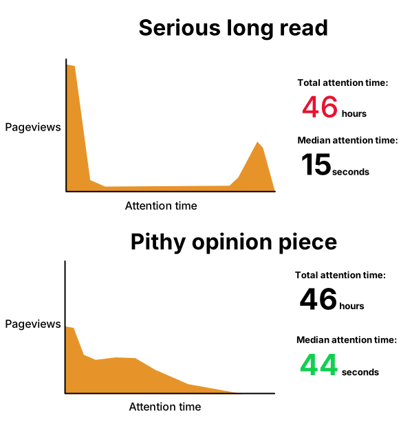
Maybe you want your metrics to frame performance this way. Perhaps you have reasons to reduce the bounce rate of articles. Perhaps it’s more valuable for you to get broad but not deep engagement.
That’s valid, but another option is to give the analytics user more article ‘health’ metrics so they can make their own call. If you throw in mean attention time or total attention time alongside the median, you give a more rounded idea of performance. You won’t be making a single judgment that applies to all your content about which metric is the truest identifier of ‘good’ performance. The big downside is visual noise – you don’t have a single indicator of success any more, and instead are relying on personal interpretation. But perhaps that’s better than optimising for a single flawed metric that might not align with your goals.
While presenting those metrics in a unified way might be a difficult UX challenge, we can still give it a shot.
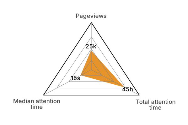
Here I’m presenting three metrics as a radar chart to make a kind of “score card” for an article. The chart implies that pageviews were okay, median attention time wasn’t great, but total attention time exceeded expectations – an articles might do well on one front without being exceptional in every way.